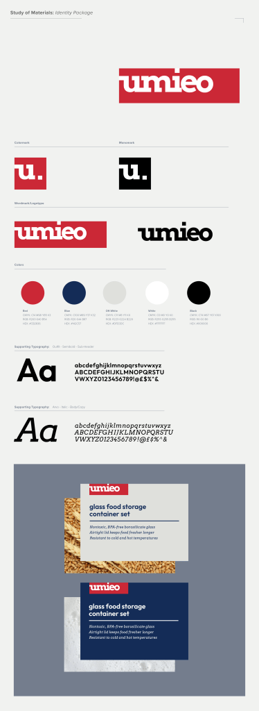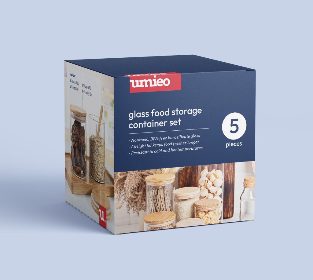
As part of an assignment for my Graphic Design IV: Systems Design course, I was tasked with rebranding a “no name” brand found on Amazon. I chose Umieo, which is a company that sells glass food containers and reusable cups. Umieo’s current logo does not represent anything about the products they sell or the market their products compete in. For this rebrand, I came up with a visual identity that fits in the food storage market (think Pyrex, Rubbermaid, and Elfa), but stands out with bold slab serif typography and clean, eye-catching layouts. As glass food storage is somewhat of a luxury, I wanted to keep the brand feeling premium without seeming impractical. To do this, I used darker shades of color with high saturation, and mature yet energetic typography treatments. I used Adobe Illustrator to create this project.